Turkish Airlines Maintains Enduring Brand Identity
The carrier's iconic red tail and white goose emblem, designed by Mesut Manioğlu, has defined its aircraft appearance since 1961, undergoing a significant refresh in 2010.
The Enduring Emblem of Turkish Airlines
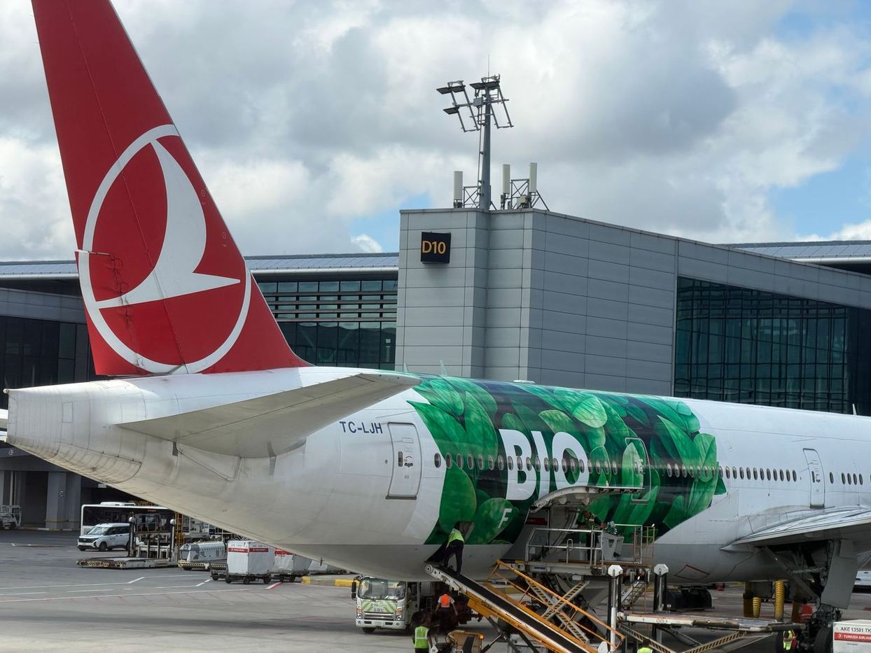
Turkish Airlines continues to feature a distinctive red tail adorned with a stylised white bird, an emblem that has been central to the carrier's visual identity since the early 1960s. This enduring design, created by Turkish graphic artist Mesut Manioğlu, was officially adopted by the airline in 1961 after winning a design competition in 1959.
For over 65 years, the white bird has represented Turkish Airlines as it expanded its global network, maintaining its presence across various aircraft types and branding updates. The consistency of this core element underscores the airline's commitment to its heritage while operating an extensive international flight schedule.
Current Livery Details and Fleet Application
The airline's current standard livery originates from a comprehensive redesign introduced in 2010. This scheme primarily features a white fuselage, prominently displaying "TURKISH AIRLINES" in dark-blue lettering along the forward section. The bright red vertical stabiliser proudly carries the white goose emblem, enclosed within a circular outline.
Additionally, the lower fuselage is painted in a subtle grey, creating a visual contrast with the white upper body. Some aircraft within the fleet also incorporate a grey tulip motif near the rear fuselage, a nod to the flower's deep cultural and historical significance in Turkey.
This design is applied uniformly across Turkish Airlines' diverse fleet, including Boeing 737s, 777s, 787 Dreamliners, and Airbus A320-family jets, A330s, and A350s, with adjustments made for different fuselage sizes.
Symbolism and Brand Recognition
The choice of the wild goose as Turkish Airlines' emblem was partly due to its natural ability to undertake long-distance flights at high altitudes, reflecting the airline's operational capabilities. Mesut Manioğlu's design also ingeniously incorporates the letters T, H, and Y, representing Türk Hava Yolları, the airline's name in Turkish, when viewed from various angles.
While Turkish Airlines has introduced numerous special liveries over the years, commemorating major sporting events, sponsorships, and significant milestones – such as a special design in 2026 celebrating its 500th aircraft with photographs of employees and retirees – the red tail and white goose remain the most immediately recognisable features of its aircraft. This consistent branding helps reinforce the airline's identity across its global operations.
Connecting Asia Through a Recognisable Brand
For Asian travellers and the travel industry, Turkish Airlines' consistent brand identity plays a significant role in its extensive network connecting Asia to Europe and beyond. Operating from its hub in Istanbul, the airline serves numerous destinations across Asia, including major cities like Singapore, Bangkok, Hong Kong, and Tokyo.
The familiar red tail and white goose emblem on its aircraft arriving at Asian airports provide immediate recognition, fostering brand loyalty and clarity in competitive markets.
This visual continuity supports Turkish Airlines' strategy of maintaining a strong presence in the region, offering a reliable and identifiable option for intercontinental travel, and reinforcing its position as a key global connector.
Get The Post.
The global travel stories that matter, three mornings a week. Free.