LOT Polish Airlines Retains Historic Crane Emblem for Aircraft Fleet
LOT Polish Airlines continues to feature its distinctive flying crane emblem across its fleet. Designed around 1929, this symbol underpins one of commercial aviation's most enduring brand identities. The logo links modern aircraft to the carrier's origins, providing consistent visual recognition.
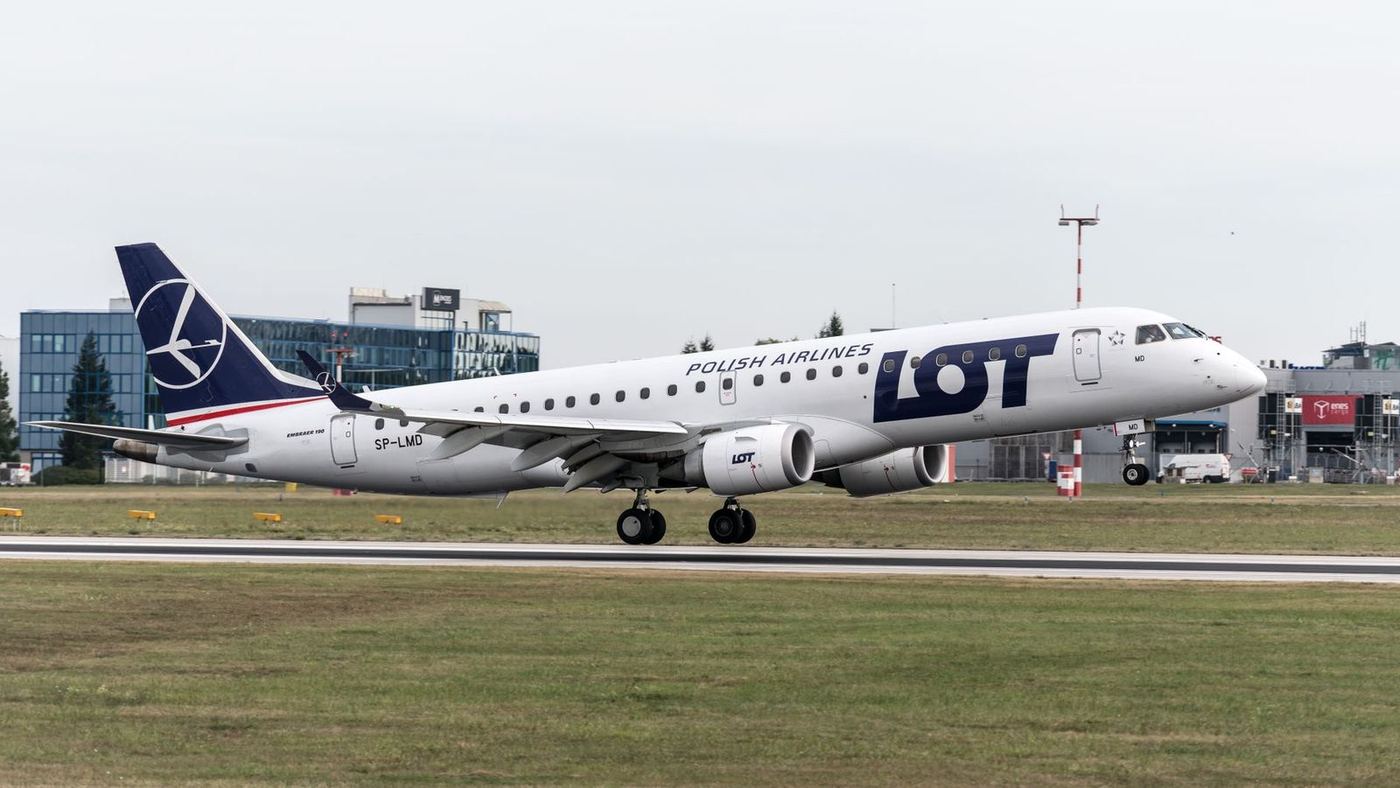
A Century of Brand Identity
LOT Polish Airlines maintains its stylised flying crane emblem as the centrepiece of its aircraft livery. This design has represented the carrier for nearly a century. Polish graphic artist Tadeusz Gronowski created the emblem around 1929. Its selection followed a competition held shortly after the airline's establishment. The logo depicts a crane in flight.
It has remained a central element of LOT’s visual identity. Though refined over decades, the basic design persists. This ensures a continuous link to the airline's heritage.
Livery Details and National Colours
The emblem appears prominently on the vertical stabiliser of each aircraft. It features a white crane set within a circular blue field. The remainder of the aircraft follows a restrained layout. A predominantly white fuselage carries large, dark-blue "LOT" titles. These are positioned along the forward section. A blue cheatline runs beneath the cabin windows.
The airline’s full name, Polish Airlines, appears in smaller lettering nearby. Red and white accents provide a connection to the Polish flag. These elements integrate national colours without dominating the overall design.
Fleet Consistency and Historical Context
This livery applies across LOT’s diverse fleet. It includes Boeing 737s, 787 Dreamliners, and Embraer regional jets. Despite variations in aircraft size, the blue tail and crane emblem ensure a consistent appearance. LOT Polish Airlines, founded in 1929, ranks among the world’s oldest continuously operating airlines. The carrier has periodically introduced special schemes.
These commemorate Polish independence or airline milestones. However, the standard design consistently relies on Gronowski’s original crane logo. This commitment reinforces a stable and recognisable brand image.
Implications for Market Presence
The continued use of this long-standing emblem demonstrates LOT Polish Airlines’ commitment to its heritage. It provides a stable and consistent brand image in a competitive aviation market. This visual continuity aids passenger recognition and brand loyalty. For the industry, it highlights the value of an enduring brand identity.
The crane logo links current operations to the airline's earliest years. This approach reinforces LOT's historical legacy. It supports a clear and established market presence for the Polish flag carrier.
Get The Post.
The global travel stories that matter, three mornings a week. Free.