Singapore Airlines' 50-Year Livery: A Masterclass in Consistent Aviation Branding
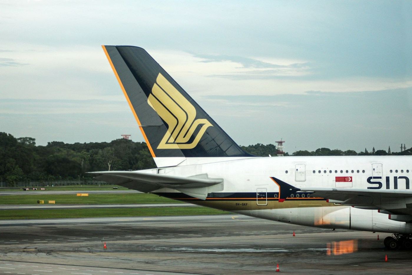
Singapore Airlines has upheld a largely consistent blue-and-gold livery design for over five decades, a visual identity that features its distinctive 'SilverKris' bird emblem. This enduring aesthetic has adapted across multiple aircraft generations while retaining its core elements, establishing a recognisable brand presence in global aviation.
Five Decades of Recognisable Branding
Singapore Airlines has maintained a remarkably consistent livery since its establishment as an independent carrier in 1972. The airline's visual identity centres on a dark blue and gold colour palette, prominently featuring its stylised bird logo, often referred to as the 'SilverKris'.
This emblem traces its origins to Malaysia-Singapore Airlines, the predecessor to Singapore Airlines, and became a defining part of the new carrier's brand following the dissolution of MSA. The core design has remained largely unchanged through numerous fleet updates over more than five decades, providing a stable and instantly recognisable image across international skies.
This consistency in branding differentiates Singapore Airlines within an industry that frequently updates its aircraft aesthetics.
Core Design Elements and Adaptations
The livery's design is anchored by the yellow 'SilverKris' emblem, which is set against a dark blue vertical stabiliser. The aircraft fuselage is predominantly white, providing a clear background for the large, dark blue 'SINGAPORE AIRLINES' titles positioned along the forward section.
A distinctive feature that runs the entire length of the aircraft fuselage is a pair of blue and gold cheatlines. This element has persevered through an era where many other airlines have moved towards more minimalist liveries, often removing traditional fuselage stripes.
The fundamental scheme has been applied to various aircraft types, including Boeing 747s, 777s, and 787 Dreamliners, alongside Airbus A310s, A340s, A350s, and A380s.
Adjustments to the scale of the titles, tail logo, and cheatlines have been made to suit aircraft ranging from narrow-body Boeing 737s to the double-deck Airbus A380, ensuring the core elements remain immediately identifiable.
Historical Aviation Moment and Brand Strategy
Singapore Airlines' livery also marked a significant point in aviation history in 2007. The carrier became the launch operator for the Airbus A380, with its blue-and-gold colours adorning the first superjumbo to enter scheduled passenger service. This inaugural commercial flight operated from Singapore to Sydney.
The sustained visual identity of Singapore Airlines demonstrates a deliberate brand strategy, highlighting stability and heritage in its global operations. For travellers, this consistency fosters immediate recognition and trust, associating the airline with a long-standing reputation for service.
For the industry, it shows the lasting value of a strong, unchanging brand presentation in a competitive global market, reinforcing brand equity over time rather than pursuing transient design trends.
Get The Post.
The global travel stories that matter, three mornings a week. Free.